The Graceland brand is not just about the shield or blue & gold. Learn about our identity.

The Graceland graphic identity has grown and evolved over the university’s 125-year history. This page represents the most accurate and up-to-date graphic representation of the brand.
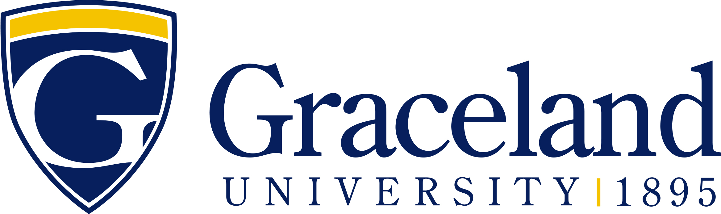
Download The Graceland Identity ManualGraceland’s main logo represents the university in all aspects, so it is critical to use it correctly and consistently. The logo is made up of two components; the shield and the wordmark. Within the shield is a large “G” reminiscent of the “G” found on campus at Big G Lake. The wordmark consists of two parts, “Graceland University” and “1895” the year of the university’s founding. The typeface used for the wordmark has been customized and is unique. Do not attempt to recreate the wordmark.
![]()
This two-color horizontal version is Graceland’s primary logo and should be used in most applications. Reverse versions are also available.


